Final poster show poster

This was my final poster for last semester’s poster show. I had a clear direction from early on, which helped guide my design decisions throughout the process. The purpose of the poster show was to raise funds for our class and senior exhibition, so it was important that each piece made a strong impression on attendees.


With that in mind, I centered my concept around the idea of “impression.” I incorporated my own fingerprint to visually reinforce the theme, and I embossed the headline into the page to create a physical impression as well, tying the concept together both visually and tactically.

poster show progress

Here is some of the progress work for that poster. I explored several iterations as I developed the design, especially when deciding how to approach the fingerprint element. Initially, the print felt too static, so I experimented with gradients and subtle manipulations to create a more dynamic effect. However, I ultimately chose to keep the original fingerprint unchanged, as I felt that altering it too much diminished its impact and its ability to leave a strong impression on the viewer.

final typography Exhibit show poster

For my final typography poster for this semester’s exhibit show, I wanted to emphasize how our individual voices come together to form a unified message. This idea led to the concept of intersecting voices. While each of us is exploring a different topic and creating distinct work, we ultimately share the same goal: to raise awareness of our projects and make them visible and impactful for viewers attending the exhibition.

final imagery exhibit show poster

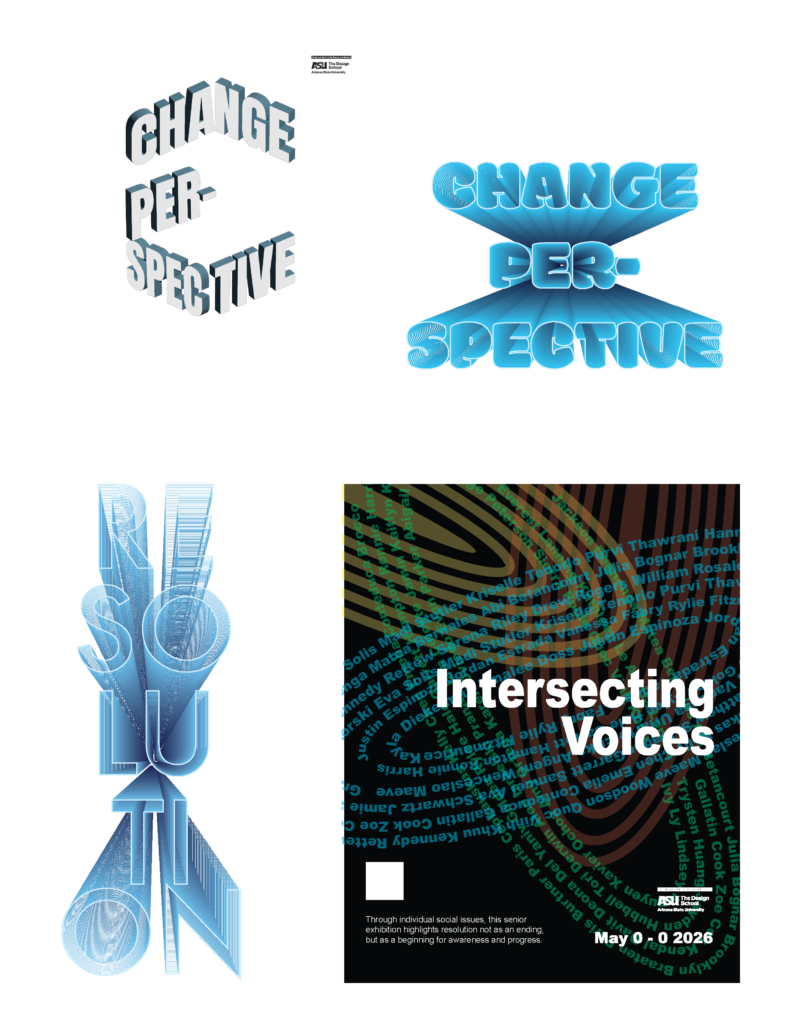
For my final imagery-based poster for the exhibit, I initially struggled to find a clear direction. I knew I wanted to use the headline “Resurrection,” as it captured the idea of bringing overlooked or ignored topics back into the light and making them visible to a wider audience. That concept became the foundation of my design.

Visually, I chose to keep the composition simple and focused, allowing the message to take center stage. I incorporated a subtle camera flare to create a sense of illumination and emergence, giving the poster an almost aura-like quality. This effect helped reinforce the theme of “resurrection,” suggesting something being revealed or brought back into awareness. By keeping the design minimal, I felt the overall impact was stronger and more intentional, allowing the concept to resonate more clearly with the viewer.

exhibit show progress

This work shows some of the process behind my exhibition posters. I went through several rounds of experimentation, testing different visual directions and concepts to see what might best communicate my ideas. While some of these approaches were interesting, they ultimately didn’t align with the tone or message I wanted to convey for this particular event.

Through this process of iteration and refinement, I was able to better understand what felt most effective and intentional, which led me to the final designs that more clearly communicate my concept and overall vision.